First Yawn: The Return Of the Wombles, Banana Yoshimoto's Book covers & Winona Ryder.
Find out what caught my eye this weekend
The Return Of the Wombles - The Original Environmentalists
The Wombles is the epitome of nostalgia for me - I’m transported back to my grandparents house in the midlands. Cup of tea warming my hands as my feet stick out in front of the brown floral sofa cushions.
The boxy tv buzzing with that forgotten theme tune - the wobbling clarinet strikes the first first chords as Mike Batt sings in his quintessentially English voice 🎵 Underground - Overground - Wombling Free 🎵.
Like many children, I watched old reruns of the 1975 edition of The Wombles in the 90s and it was a family occasion. I have fond memories of my Nana taking a moment between sorting tea in her apron - eyes glued to the tv screen, watching these fuzzy stop motion characters digging in bins in Wimbledon Common.
The London and LA based studio How&How have refreshed the identity of this beloved children’s tv show, resurrecting the furry characters with a new sense of purpose after their 50 year hiatus. Returning to champion sustainability, a love of nature and the importance of community.
The How team playfully refocus the narrative, tapping into the core values of these cosy characters. Putting a new spin on the phrase “trash is treasure”. With the show celebrating 50 years of being on screen, I can’t wait to see the return of the Wombles!
Redesigning Banana Yoshimoto's Book covers With Sophie Harris
Refreshing an established authors look is a daunting challenge, it needs to appeal to the writers core audience whilst also feeling fresh and attracting new audiences. Senior designer at Faber - Sarah Harris did just that with her beautiful book covers for these poetic novels by Banana Yoshimoto.
‘We need to divorce ourselves somewhat from their pre-existing and well-loved covers to make sure we bring something new and exciting. Another consideration is how the new look will work across their upcoming titles and backlist. A design too idiosyncratic can prove tricky.’
Rather than designing Banana’s backlist from the start, Sarah was given a single brief for a new English translation of The premonition. A clean slate in which to experiment with new ideas. Faber editor Angus Cargill, highlighted the importance of capturing atmosphere.
The premonition is a story of a 19-year-old girl finding her place in the world, with the tone gently supernatural and dreamlike. Water features heavily throughout the book, so this is where Sarah’s initial concept work began.
Sarah’s design started rather broad with different approaches to the cover such as photography and illustration. Besotted with the work of Taiwan based photographer Zhong Lin, Sarah thought her surreal and uncanny photographs of female subjects would work well for the book. Sarah also tried her hand at digitally illustrating the covers with rippling water reflecting the moon at night.
After discussing her initial ideas with the team the more illustrative route was taken and Sarah was tasked to design Banana’s most well-known novel - Kitchen. Ex Faber designer Jonny Pelham’s 2018 Jacket for Kitchen was iconic, full of colour with its hot pink jacket and floating cooking implements.
The theme of cooking and eating together was unsurprisingly a key part of the book and Sarah was keen to feature that on the cover. Here we can see her mood boards whilst researching. To keep to the muted, atmospheric colour pallets and tone Sarah explored images of kitchens at night, with shadows encroaching on the tabletops.
Omitting characters from the cover Sarah’s designs implied the meeting of people but highlighted the eerie absence of anyone eating the food.
‘So far in this series, I have chosen to illustrate night-time scenes. I find that these allow me to play with light and shadows in an interesting way to create the atmosphere and slightly supernatural elements of Banana’s writing.’
I personally think Sarah does an incredible job of capturing the elusive atmosphere of Banana Yoshimoto’s novels. Although I think the silhouetted style lends itself more to an anthology of novels such as Banana’s collection, I would have loved to have seen her develop the more traditional hand drawn styles of the covers as her illustrations are beautiful. What do yo think? Have you read any of banana Yoshimoto’s novels before?
Purchase the redesigned covers of Banana Yoshimoto’s The Premonition & Dead End Memories here
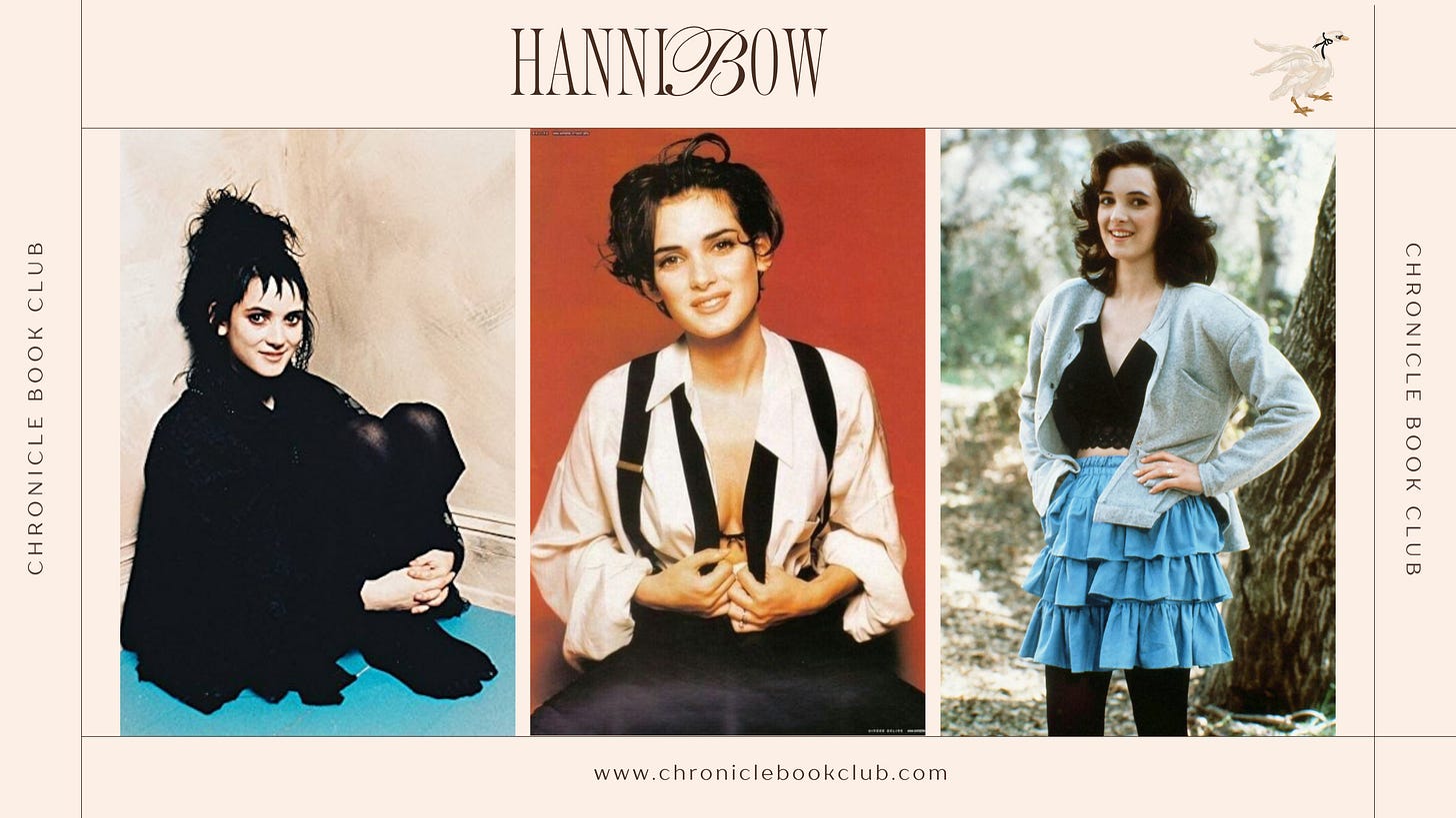
Winona Ryder Breaking Down Her Iconic Looks
I am such a huge Winona Ryder fangirl! Reflecting on her iconic looks and unforgettable roles has been an absolute delight. From the enigmatic Lydia in Beetlejuice, rocking that gothic flair with her dark ensembles and haunting demeanour, to the sharp-witted Veronica in Heathers, navigating the treacherous waters of high school cliques with style and sarcasm.
Who could forget the ethereal beauty of Kim in Edward Scissorhands, where Winona's character taught us about love and acceptance beyond appearances? And of course, Joyce Byers in Stranger Things, the fiercely protective mother who would go to the ends of the earth—or the Upside Down—for her children.
As a teenager, I desperately wanted to emulate Winona's unique style and the depth she brought to her characters. Her blend of vulnerability and strength resonated with me, inspiring not just fashion choices but also a sense of individuality and self-expression.
If you're a fan like me or simply appreciate iconic cinema moments, you can watch the full conversation over on YouTube —let's reminisce together!
Like what you see? Help me keep creating our bookish content by treating me to a coffee. You’ll get really good karma 😉😘


